Transforming a legacy enterprise legal operations platform through research-led UX strategy, navigation architecture redesign, and a new ground-up design system.
Overview
Context
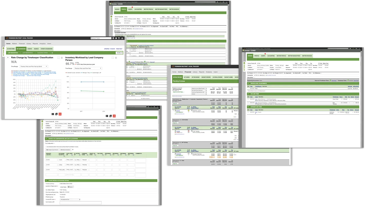
Thomson Reuters Legal Tracker is an enterprise SaaS platform used by corporate legal departments to manage spend, vendors, reporting, and matter workflows across global organizations.
Over time, the product evolved feature-by-feature, resulting in deep functionality, but fragmented navigation, inconsistent interaction patterns, and growing usability friction. As enterprise clients scaled their usage, the cognitive cost of navigating the system became increasingly apparent.
This initiative focused on modernizing the experience without disrupting mission-critical legal workflows.
Problem
The platform suffered from structural usability issues:
- Inconsistent navigation architecture across modules
- Visual density that increased cognitive load
- Interaction patterns that varied by feature area
- No unified design language
- Decreasing user confidence despite functional depth
These were not isolated UI issues. They were systemic. Without architectural change, the product risked declining usability perception and reduced stakeholder confidence.
Solution
We conducted a full-system heuristic audit, benchmarked usability with enterprise clients, redesigned the information architecture, modernized key workflows and dashboard, and built a scalable design system from the ground up.
The result was a cohesive, enterprise-grade platform foundation built for clarity, scalability, and long-term growth.
The result was a cohesive, enterprise-grade platform foundation built for clarity, scalability, and long-term growth.
Details
Length
Multi-phase modernization initiative that we worked on for about 8 months
Platform
Enterprise web application
Role
Lead Product Designer
Work
Heuristic evaluation, usability benchmarking (SUS), focus groups, navigation architecture redesign, dashboard modernization, workflow simplification, design system creation, executive presentation, sales prototype creation.
Team
Cross-functional collaboration across Product, Engineering, Legal SMEs, and Sales stakeholders.
Initial state
Defining the Solution
Approach
- Conducted a comprehensive heuristic audit across the entire platform
- Printed and reviewed every page to identify systemic patterns
- Evaluated findings using Nielsen’s 10 Usability Heuristics
- Facilitated enterprise focus groups and workflow testing
- Collected System Usability Scale (SUS) benchmarks
- Synthesized research into architectural priorities
- Defined modernization principles aligned with enterprise constraints
Hard Skills
Heuristic evaluation
Usability benchmarking
Information architecture
Soft Skills
Systems thinking
User advocacy
Cross-functional alignment
Research & Evaluation
Full-System Heuristic Audit
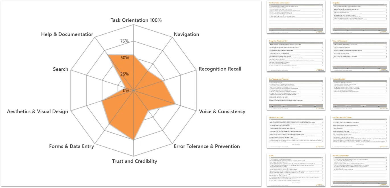
To understand the scope of usability friction, we conducted an exhaustive review of the entire product. Every page was printed and reviewed collaboratively. Using Nielsen’s 10 Usability Heuristics as a structured evaluation framework, we mapped strengths and weaknesses across the site.
- Visibility of system status
- Match between system and the real world
- User control and freedom
- Consistency and standards
- Error prevention
- Recognition rather than recall
- Flexibility and efficiency of use
- Aesthetic and minimalist design
- Help users recognize, diagnose, and recover from errors
- Help and documentation
Key Insight
Usability issues were systemic, not isolated. Navigation structure and interaction inconsistencies were primary contributors to cognitive load.
Hard Skills
Heuristic evaluation
Research synthesis
Enterprise UX strategy
Soft Skills
Systems thinking
Stakeholder facilitation
Executive communication
Heuristic evaluation of existing state
Evaluation results
Enterprise Client Research
We conducted moderated focus groups and workflow testing sessions with enterprise clients including:
Adobe, Nike, and Stryker.
Methods
- Scenario-based workflow testing
- Moderated qualitative interviews
- System Usability Scale (SUS) surveys
- Thematic analysis of sentiment
Findings
- Strong appreciation for platform capabilities
- Frustration navigating across modules
- Inconsistent terminology increased cognitive effort
- Visual density reduced scannability
- Lack of predictable patterns decreased confidence
This research validated that modernization required architectural, not just cosmetic change.
Hard Skills
Heuristic evaluation
Research synthesis
Enterprise UX strategy
Soft Skills
Systems thinking
Stakeholder facilitation
Executive communication
Focus groups (System Usability Scale questionnaire)

Design & Iteration
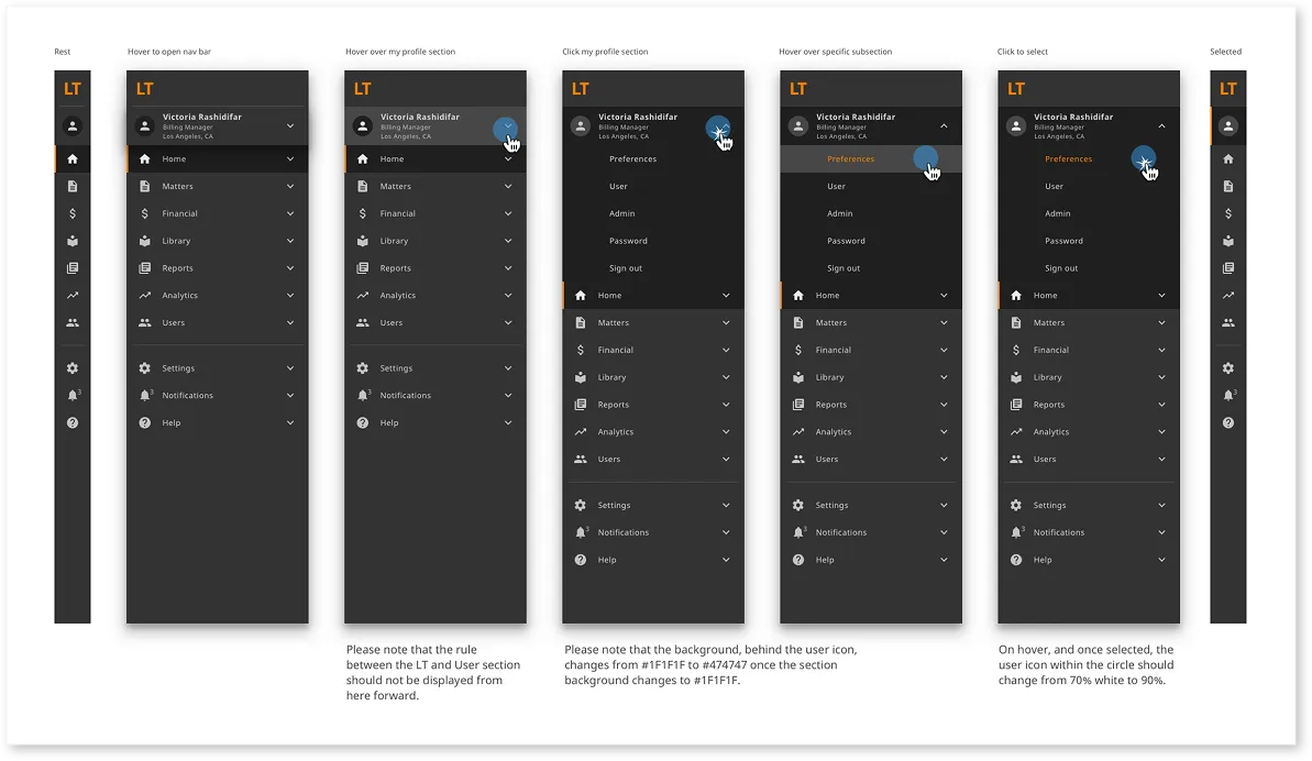
Navigation Architecture Redesign
Navigation was identified as the primary friction point, so we redesigned it from the ground up:
- Reorganized modules around workflows instead of legacy groupings
- Introduced clearer hierarchy and section grouping
- Improved progressive disclosure
- Standardized labeling and terminology
- Designed for scalability as new modules are introduced
This structural shift reduced disorientation and improved system predictability.
Navigation prototype
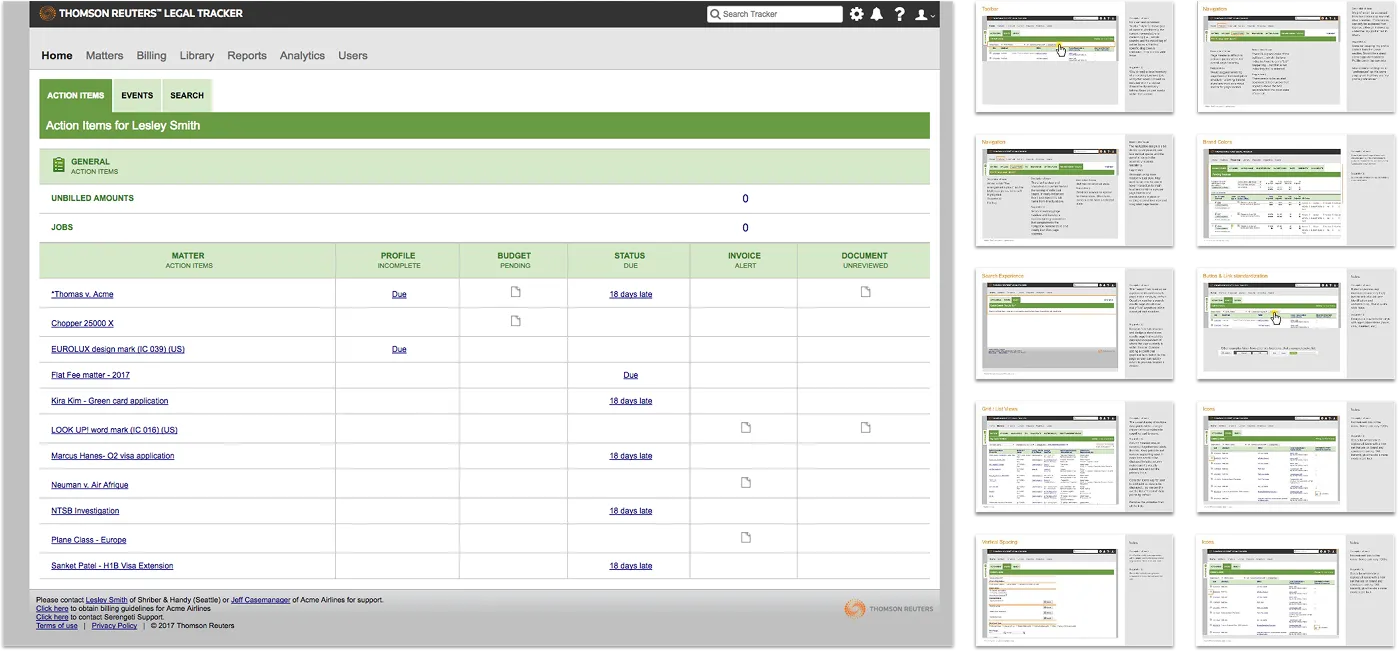
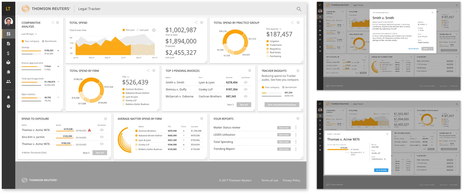
Dashboard Modernization
The dashboard became the visual anchor of the modernization effort.
Goals
- Increase scannability
- Surface actionable data (accomplished via on page "quick view" shown below)
- Reduce visual clutter
- Elevate enterprise polish
The updated dashboard also served as a high-fidelity prototype for sales demonstrations, reinforcing perceived product maturity.
Dashboard update
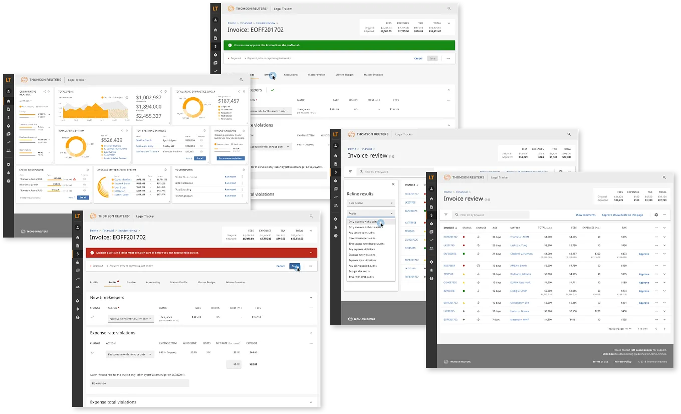
Workflow Simplification
Starting with high-impact workflows, we:
- Reduced redundant steps
- Clarified system feedback
- Standardized filtering and form behaviors
- Improved visual hierarchy
- Increased accessibility compliance
- Created shared language between design and engineering
Rather than redesigning individual screens in isolation, we implemented consistent structural patterns across modules.
Hard Skills
Interaction design
Workflow mapping
Usability testing integration
Soft Skills
Systems thinking
Cross-functional collaboration
Iterative feedback integration
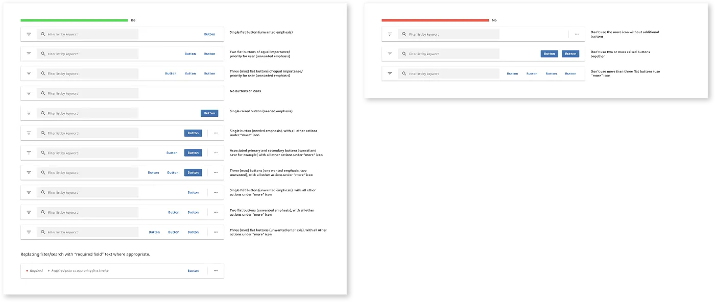
Task bar (search, filter and actionable buttons)
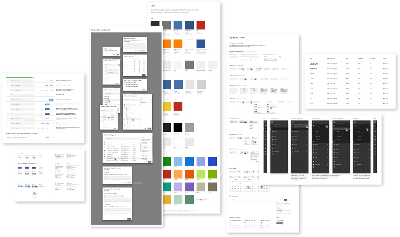
Design System
To ensure long-term consistency, we built a comprehensive design system in Sketch from scratch (inspired by Google Material Design), and published it for cross-team adoption.
System Components Included
- Typography ramp
- Color system and accessibility standards
- Button hierarchy
- Dialog and modal patterns
- Form fields and validation patterns
- Filter systems
- Dropdowns and selectors
- Calendar components
- Alerts and announcement patterns
- Spacing and layout system
Design System Impact
- Unified visual language across modules
- Reduced interaction inconsistencies
- Increased development efficiency
- Reduced design debt
- Enabled scalable product growth
- Created shared language between design and engineering
This system became the structural backbone of the modernization effort. We created not just a UI kit, but an operational foundation.
System components
Latest iteration incorporating new system
Retrospective & Reflection
Learnings
- Importance of user-centric design in compliance tools
- Value of iterative testing and feedback loops
- Need for cross-functional collaboration in complex projects
Next steps
- Explore integration with other fleet management tools
- Adapt tool for use with other types of inspections i.e. buildgings, airplanes, etc.
- Identify areas for further enhancement of existing UI and userflow
Hard Skills
Post-project analysis
Documentation
Knowledge sharing
Soft Skills
Self-reflection
Adaptability
User research and analysis